{graphics} Anatomy of a Banner: Inside Man
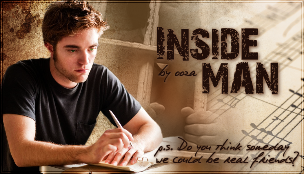
I finally made a banner for Inside Man! The story crept up on me, and I didn’t want to wait for a banner to start posting. That and I had absolutely no idea what to do with it. I’m glad I waited, because now I have a fun quote to put on it.
The most challenging part was finding the perfect Edward photo. Rob is kind of young for this Edward, but I just couldn’t resist putting him on it. Had I found the perfect photo of “unnamed man writing a letter,” perhaps I would have used that, but I did a lot of searching and no stock photos tickled my fancy.
The original picture I had was good—kind of sad looking and wearing possible prison garb—but it seemed out of place when I started working with it. I asked IngenueFic for help, and because she’s awesome, she sent me a Remember Me screen shot. I ended up finding a movie still that would be a bit easier to work with. Quality is key, after all.
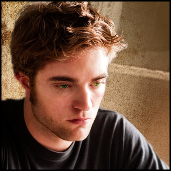
The still, shown below, was almost perfect. Rob Tyler Edward looks pensive and sad. He’s writing something. A letter to Bella, perhaps? His hair was tamed and the photo is higher quality, making it easy to remove him from the background. There was just one problem.

As you can see, he has clearly had the shit beat out of him. Not exactly conducive to the story line. My first thought was, What the hell? He is in prison. I’m sure he’s had his ass kicked at some point. But then I started thinking maybe I could remove the bruising and open wounds with my mad GIMP skillz.
For the lip and forehead, I used a combination of the clone tool and healing tool to color in the bloody spots with the surrounding skin. Then I made a new layer and using the color picker, took shades from his face and filled in the bruising around the eye and on the cheek and hand. I turned down the opacity on the brush to roughly 16%, then changed the layer type to screen and adjusted the transparency on that to 70%. This is the result I got:

For the background I found a picture of a man behind bars that I made sepia, a brown toned texture to go behind that, and sheet music. That was probably the easiest part. The title gave me some issues. I couldn’t quite find a font that was perfect. I ended up using 28 Days Later for the title and PhontPhreak’s Handwriting for the tagline which, if you hadn’t noticed, is the font I use for Edward’s letters on the blog. (For those interested, Bella’s font is Dawning of a New Day.)
After some blending and shadowing and other top secret tricks, not to mention coloring his eyes green, that is always my FAVORITE thing to do, I present to you the Inside Man banner:

BellaSunshine June 16, 2011 at 9:44 pm
Love it! Fantastic job! :)
Misti June 16, 2011 at 9:45 pm
An incredible banner for an incredible story. Nicely done!
Nita June 16, 2011 at 10:40 pm
Love it. I love coloring his eyes too. Didn’t know you were a GIMP gal! I am too. Not as advanced as you, it would seem, so I’ll follow these posts of yours.
ooza June 16, 2011 at 10:54 pm
Love the GIMP! If I could marry it I would. I’m usually impressed with what I create because I really have absolutely no idea what I’m doing most of the time. :/