
Anatomy of a Banner: Tentacleward
Let me begin this post by saying DONUT JUDGE ME! Luvrofink asked me to make a banner for her newest one-shot, The Extraordinary Dream. She said if I could make an Edward with wings, I could make one with tentacles. I’m always up for a challenge, so I agreed. And let’s be honest. If you’re going to be ballsy enough to write tentacle!porn, someone should be ballsy enough to make you a kick-ass banner.
As with any banner I make, the first think I have to do is find the right picture(s). For this one, I wanted one of Edward and Bella, and I wanted his hand to be visible and reaching toward her. Because manips are hard, I only wanted to turn a single finger into a tentacle. Also, I wanted to creep out the least amount of people who see this banner. I decided on this very HQ Breaking Dawn promo photo, and this single tentacle. (Click for larger images)
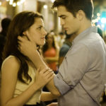
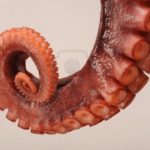
The first step was to cut out Bella and Edward from the background so I could give them a new one! I don’t always do this, but in this case I didn’t want them to be in the middle of a busy crowd. Once that was done, the search for a new background began. I asked luvrofink where the debauchery took place in the story. She said the bathroom. I wanted to incorporate the story’s theme into the bathroom. I found a few images with octopuses on the shower curtain, and ultimately decided on the one below because I could put the pair on top of it and you could still tell they were in a bathroom.
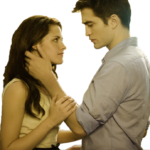
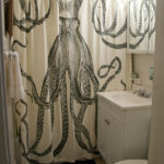
The image I really wanted to use was too small to work with. *sad panda* Unfortunately real images of bathrooms with octopus themes are hard to come by, and the only ones I could find were portrait. I made sure to ask luvr if she minded having something resembling a book cover rather than the traditional store banner before I proceeded.
The next step was to put our favorite couple in the bathroom. I rescaled them, slapped them in the bathroom, and then cropped the photo to a 3:4 ratio. I also blurred the bathroom in the background to make it look more believable. Oh, the things I’ve learned since taking up photography as a hobby!
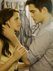
Now for the fun/tough/creepy part—giving Edward a tentacle! I took the photo I originally found, cut away the background, then scaled and rotated it to lie over his thumb. I also had to straighten out the fat end of it a little bit so that it would fit better. I added a layer mask and used a gradient to blend the image with his thumb. I also tried coloring some of his visible fingers a pinkish purple hue, as if the other tentacles were in her hair, but I couldn’t get it to look right, so I scrapped the idea.
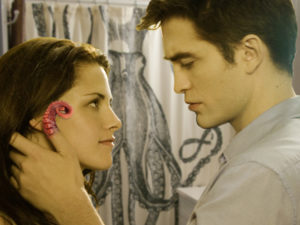
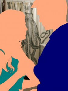
It was at this point, with the colorless background and pretty pink tentacle, that I realized this has got to be the most boring photo in all of Twilight history. The colors are so . . . blah. It’s lackluster, really. I decided to make Edward’s shirt bluer and Bella’s dress green. Why green, you ask? Why the fuck not? I created 3 new overlays (for the shirt, dress, and skin) and played around with different colors and opacities until I achieved my desired results. For fun, here’s what it looked like without doing anything special to the layers.
And here’s a side by side comparison of the original two images and the final image. I think the changes really make the photo pop but are still subtle enough that it looks natural. Except for that tentacle of course.
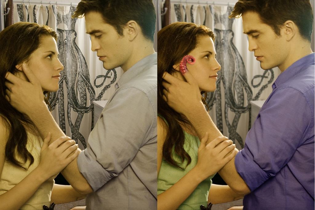
I’m actually really pleased at the way the lighting worked out. In the original image, the light is coming from behind Edward, putting most of the illumination on Bella’s face. It’s very plausible that the visible light could be coming from the vanity over the bathroom sink, which you can see a corner of behind Edward. W/W? FY.
After making a few final color tweaks, it was time for text. This is the part of banner making I hate. If I could just hand it off to someone else at this point, I would be perfectly happy. I don’t really know any cool effects other than filling in text with a texture and giving it a shadow, and finding a font is always a nightmare. I searched for tentacle fonts. Surprisingly there aren’t really any out there. Shocking, I know. I narrowed it down to three octopussy looking fonts, but ended up choosing Hippocritic because it was the hardiest of them and would show the octopus skin texture the best. For the author line, I used Day of the Tentacle.

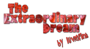
Slap it all together and . . . *drum roll*
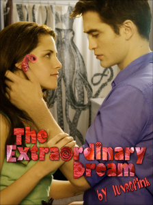
(click to enlarge)
So there you have it! I hope you’ve enjoyed this edition of Anatomy of a Banner. Don’t forget to check out The Extraordinary Dream for some hawt tentacle!porn!
It’s not all about the tentacles, though. I think you’ll find this version of Edward has a very special personality of his own. It may be a one-shot, but luvrofink has managed to bring a depth and sweetness to this character that I haven’t seen in a long time.
Enjoy!
Links:
Tentacleward on fanfiction.net
luvrofink’s website
luvrofink on Twitter
luvrofink January 21, 2012 at 2:34 pm
Hello, darling ebil tongue kitteh! Thank you so much for the banner and the support! Our gchats would be so lame without you! (not just bc i’d be doing it all alone, but bc you’re so awesome!) Thank you, thank you, for taking this on and showing Tentacleward the love he deserves!