Anatomy of a Banner: The Better Angels of Our Nature
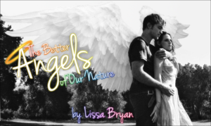
When I found out that The Better Angels of Our Nature by Lissa Bryan didn’t have a banner, I really, really wanted to make one. You see, I’ve been waiting a long time for an Angelward story to come along . . . that and I recently had a dream where Rob played an angel in a movie, complete with wings, and I wanted to see it with my real eyeballs.
The hardest part about making banners, for me anyway, is finding the right pictures, especially when manips are involved. There aren’t too many stock photos of Rob with wings floating around, so I had to improvise. First, I searched the interwebs for pictures of angel wings. When I found a bunch that I felt would look good, I went to work finding the perfect photo of him to put them on.
I felt that with the wings being manip’d already, I’d rather not have two separate pictures of Edward and Bella to put together as well. And as if finding a photo of Rob alone that would go with one of the wing pics was hard enough, now I had to find one of both him and Kristen. As I’ve stated before, I don’t ship them or anything; I just feel that if you use one for a character, you have to use the other as well. Anyway, I digress. These were the two photos I decided on (click to enlarge):

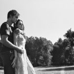
The first thing I did was play around with putting wings on these two photos. Why both, you ask? Because it’s good to have a backup plan. Originally I thought the picture on the left would work the best because it was in color and was slightly higher quality (neither of the pics are the best quality, which I typically shy away from, but hey, gotta work with what’s available). Once I got the wings on, it didn’t quite look right. Also, I felt the looks on their faces didn’t quite fit with the mood of the story. See? Backup plan.
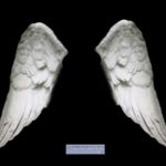
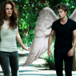
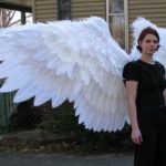
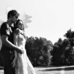
At first I was like, “Hoorah! Wings!” But then I started cropping the image and I thought, “This really isn’t working out.” They are standing so close to the left side of the photo that the wings were cut off, and those are some nice wings! It was a darn shame.
So I started over. Mostly.
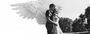
I made a new, wider image in GIMP and pasted into it the layers I was working on. Then I attached the rest of the wing, flipped the background that was cut from the right and pasted it on the left, and cleaned up the seams in the sky and trees a little bit with some blurring and gradients.
Before:
After:
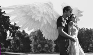
After applying some blurred overlays to make the wings pop out more and hide the overall crappy quality of the original photo, it was time for text.
This step . . . I despise it.
I wanted a pretty handwritten font, so I went to dafont.com. As luck would have it, Jenna Sue tickled my fancy on the first page!
I also knew that I wanted to put a halo on the “A”. Searching for halos is not an easy task. Most of the search results were for the video game, a good portion were wedding bands, and the rest mostly consisted of fuzzy Halloween costume halos. I found one, one, that I felt would work.
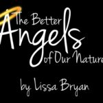
The next step was adding outline, shadow, and color to the text. I really struggled with the color because the photo was black and white. I tried black, white, and grey text, but it needed some color (other than the halo) to make it really pop. I played around with single colors, but I didn’t like any of them. Ultimately I decided on rainbow, because I’m indecisive, and damn it all, I like rainbows. In retrospect, it probably would have looked nicer to use two colors (yellow for “Angels” and a bright, solid color for the rest of the text), but by the time I thought of it I had already angled the text and fitted the halo around the multiple layers, and I didn’t want to redo it all.
The last step was a border. I feel that all banners need a border, even if it’s a simple 1 pixel black line, which is exactly what I did in this particular case. I played around with fancier ones, but they were all too distracting. The final result is at the top of this post, so scroll up and click on it to have a better look. Also, check out the story (and Lissa Bryan’s others) if you haven’t already. The link is at the top as well. :)
XennyPayle February 12, 2014 at 4:39 am
is the girl with the super awesome wings you? If it is could you please tell me where you got the feathers if you didnt make them. I need big feathers for the wings im making and it would help a lot.