Anatomy of a Banner: Malice in the Garden
I had a long day and didn’t feel like writing when I got home, so instead I fired up The GIMP and made a banner for Malice in the Garden, the sequel to Here in the Garden of Sin. I haven’t actually started writing the story yet, but whatevs. A girl’s gotta be prepared.
First, let’s start off by looking at the original banner:
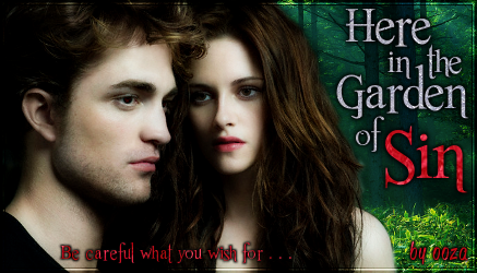
I wanted to do something similar. The first thing I did was find a HQ image of these two from the same photo shoot.
Hey, that works!
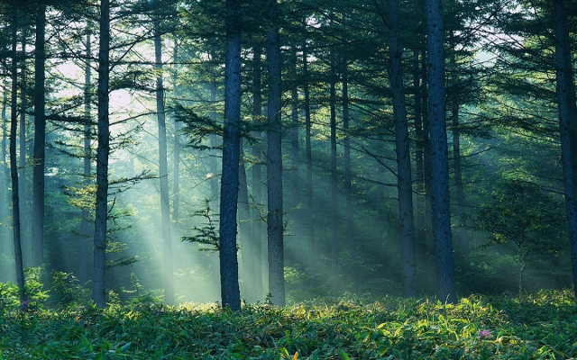
Then I dug up the old background images and textures I’d originally used. Good thing I never delete anything. Ever.
Next I fit the image into the same aspect ratio as the original banner, which is 437 x 250. Why on earth I made it that size I’ll never know. I wish I’d made it bigger. Maybe there wasn’t a HQ image available at the time or something. Or I was young and dumb. Anyway, after I deleted the background, I realized there was a bit of a problem because Bella was missing part of her arm. Nothing a little fake skin and hair can’t fix.
It’s not perfect, but it’ll do.
The next step was to add in the background. I flipped the image horizontally and made a different part visible, so it looks the same but not really. I also copied the layer with the characters, did an auto color correct, blurred it, overlayed it, and lowered the transparency. This gave the image some depth, as well as brightened up their skin for a nice pale vampy look.
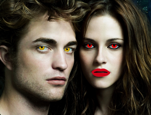
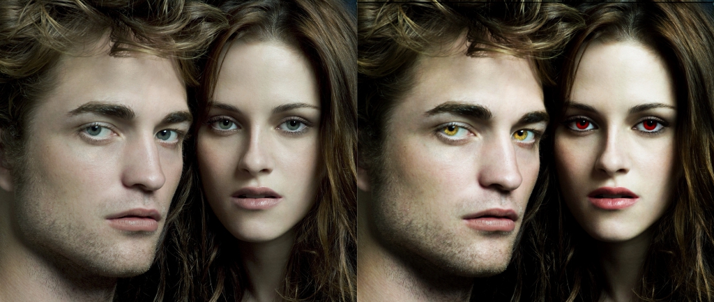
But… they still weren’t vampy enough. I gave Edward golden eyes and Bella newborn red eyes, as well as some lip color and eye makeup.
GAH!
Phew! That’s better.
With the main part of the banner done, it was time to add some text. I used Romance Fatal Serif by Juan Casco.
Meh. That’s boring. Let’s get out those textures!
After the textures were added, I gave the words a black border and a drop shadow. Normally I drop my shadows down and to the right, but with background image reversed and the light coming in from the upper right corner, I thought, why not drop the shadows down and to the left? Done.
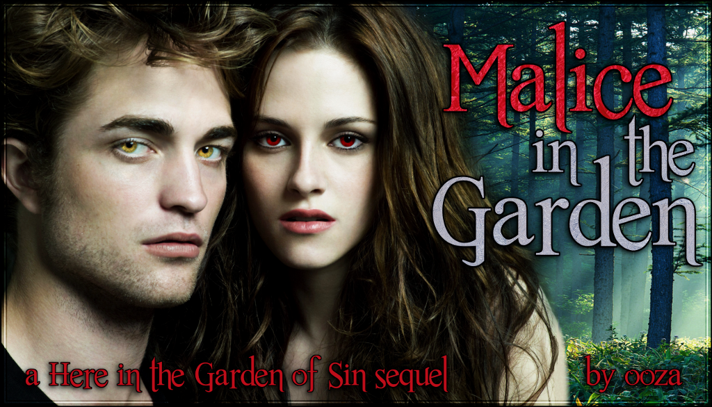
Once I was confident that I liked the text, I added the “a Here in the Garden of Sin sequel” tagline and my name. Cuz it’s mine. MIEN! I also put on a border cuz that’s how I roll.
And voilà! (Click for 1024 x 586 image)
Let’s get a side by side of those faces, shall we?
Stay tuned for more information about Malice. You can also read more Anatomy of a Banner posts or view all my banners.







Debbie September 11, 2013 at 3:20 pm
Very cool! I love the banner, and can’t wait to read the sequel when you post (which I hope will be soon!)
ooza September 20, 2013 at 8:06 pm
Thanks! I hope so too. I want to get the entire outline done and a good portion of it written so I can delivery frequent updates. I’ve written the first two chapters already! :)
J September 11, 2013 at 5:59 pm
Very nice! I wish I knew how to make a banner like you. Oh well, maybe if I take that Photoshop class I’ve been meaning to take I will learn.
ooza September 20, 2013 at 8:08 pm
Thank you! I use The GIMP (free!), and I taught myself everything I know. I’m sure hardcore Photoshop users think I’m a hack, but oh well. I learned by following random online tutorials until I understood what everything did and the kinds of effects they make. You should try some time. :)
Bikechick3 September 12, 2013 at 10:54 am
That was a fascinating read! And probably as much work to write than making the banner – thank you!
ooza September 20, 2013 at 8:09 pm
Oh, no. The banner took longer by hours, lol.
MzPeaches October 12, 2013 at 9:39 pm
I am looking forward to your posting this new story!!